
Swatch types
Colour, Image, Label and Dropdown: choose how each attribute's values show on the product page.
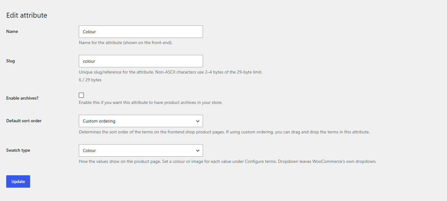
Each global attribute has a Swatch type, set on its add and edit forms under Products → Attributes. It applies to every product that uses the attribute.
| Type | On the product page | Set up per value |
|---|---|---|
| Dropdown (default) | WooCommerce's own dropdown, unchanged | Nothing |
| Colour | A colour chip per value, the name in a tooltip | A colour |
| Image | A photo per value (fabric, finish, pattern), the name in a tooltip | An image |
| Label | A button with the value's name | Nothing |
Setting the type
- Go to Products → Attributes.
- To change an attribute, click Edit under it. To add one, use the form on the left.
- Choose the Swatch type and click Update (or Add attribute).
The product pages change right away. Values without a colour or image yet show an empty, striped chip until you set one: see Colours and images.
Which type to choose
- Colour for colours you can name and show as one flat colour: Sage, Navy, Terracotta.
- Image when a flat colour isn't enough: wood grains, metal finishes, prints, patterns, melange fabrics.
- Label for sizes, lengths, capacities, anything that reads better as a word: S, M, L, 500 ml.
- Dropdown for long lists (fifty fragrances) where a dropdown is quicker to scan.
Custom attributes
Attributes typed on a product's Attributes tab (not under Products → Attributes) have no terms, so they can't have colours or images. They stay dropdowns unless you switch on Custom attributes in the settings, which shows them all as Label swatches.
Note
Swatchline Pro adds a Variation image type and lets you set a type, colours and images on a single product, also for its custom attributes.