
Using swatches
Settings
The shape, size, label style, tooltips, the chosen value and custom attributes, under WooCommerce → Settings → Products → Swatches.
Swatchline's settings are under WooCommerce → Settings → Products → Swatches. They apply to every swatch in your store.
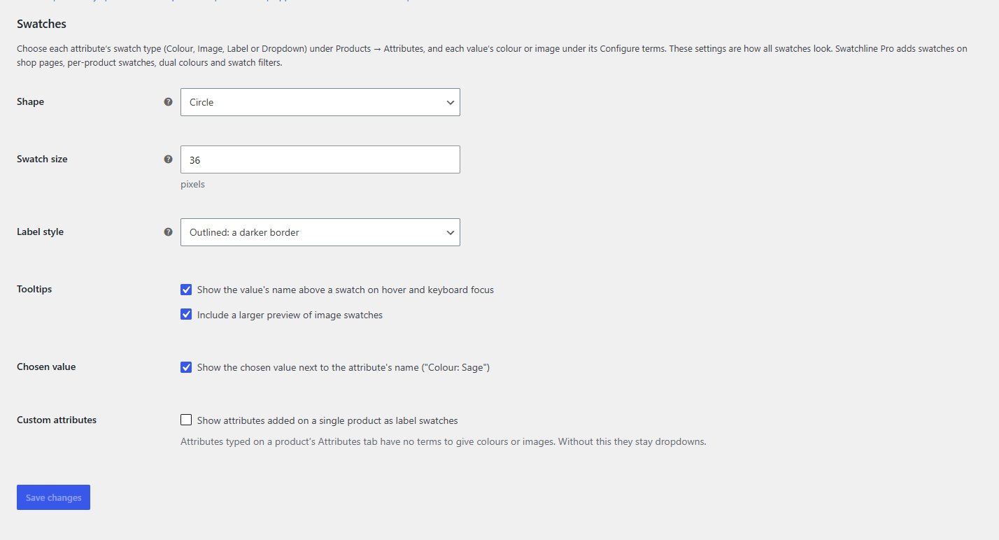
| Setting | What it does | Default |
|---|---|---|
| Shape | Circle, rounded square or square, for colour and image swatches. Label swatches are pill-shaped with Circle, boxes otherwise. | Circle |
| Swatch size | The width and height of colour and image swatches on the product page, 16 to 96 pixels. Label swatches are as tall. | 36 |
| Label style | How the chosen label swatch stands out: Outlined (a darker border) or Filled (dark, with light text). | Outlined |
| Tooltips | Show the value's name above a swatch on hover and keyboard focus. The second box, Include a larger preview of image swatches, adds a bigger picture to the tooltips of image swatches. | On, both |
| Chosen value | Show the chosen value after the attribute's name: "Colour: Sage". | On |
| Custom attributes | Show attributes typed on a single product as label swatches instead of dropdowns. | Off |
Click Save changes. Product pages use the new settings straight away (clear your page cache if your site has one).
Matching your theme
The swatches use your theme's text colour for the chosen outline and the crossed-out line, and its font for labels and tooltips. For anything more, a theme or child theme can set these CSS custom properties on .swatchline-swatches:
| Property | What it is |
|---|---|
--swatchline-size |
The swatch size (the setting above) |
--swatchline-ring |
The chosen swatch's outline |
--swatchline-line |
The thin edge around swatches and labels |
--swatchline-tip-bg, --swatchline-tip-fg |
Tooltip background and text, also used by filled labels |