
Block themes
Swatches in the Add to Cart Form block and the Add to Cart + Options block, and how they work with WooCommerce's own text chips.
Block themes such as Twenty Twenty-Five build the product page from blocks. Swatchline works with both of WooCommerce's add-to-cart blocks.
The Add to Cart Form block
WooCommerce's single product template uses the Add to Cart Form block by default. It draws WooCommerce's classic variation form, so the swatches are exactly as in a classic theme: see The product page.
The Add to Cart + Options block
The newer Add to Cart + Options block has its own variation selector. For each attribute it shows WooCommerce's text chips or a dropdown, as set on the block.
For attributes with a swatch type, Swatchline shows its swatches there instead:
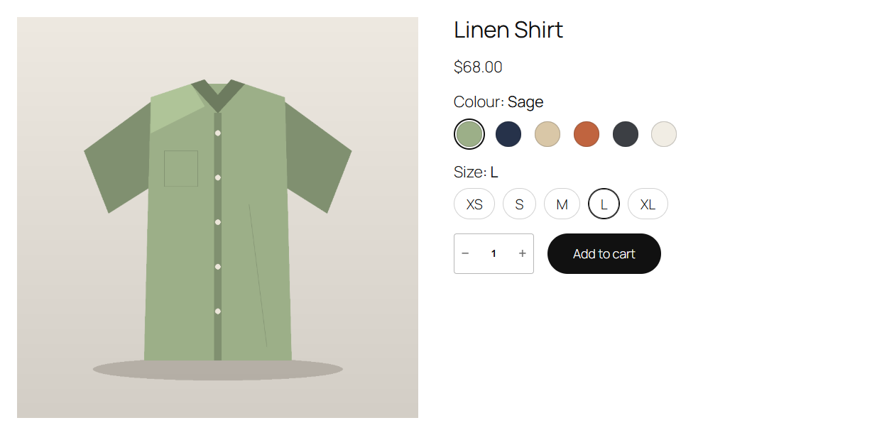
- It switches the attribute to the block's own dropdown, hidden, and puts the swatches after it. Choosing a swatch sets that dropdown, so the block updates the price, the image, the stock and its add to cart as it always does.
- The chosen value appears after the attribute's name, and unavailable combinations are crossed out, as on the classic form.
- Attributes left on Dropdown keep the block's chips or dropdown, as you set them.
You don't need to change the block: add it to your single product template (or to a page, inside a Single Product block) as usual.
WooCommerce's colour swatches
Recent WooCommerce versions have an experimental "Color / image" attribute type for block themes. Swatchline doesn't use or change it: an attribute with that type whose Swatchline swatch type is Dropdown is left to WooCommerce. Give the attribute a Swatchline swatch type to have Swatchline's swatches in classic and block themes alike.